
Here’s a collection of the best dark dashboard UI designs that you can use as inspiration for your own project! Desktop, mobile, and elements.
Related: Mobile Dashboard UI Design Inspiration
Why Dark Mode for Dashboard Designs?
Dashboards are well-suited for a dark mode design style since they hold a lot of data, graphs, and tables. Such content can easily look messy, and a dark mode style makes it clearer to look at. With a dark mode design, you can add colorful gradients, clarifying illustrations, and icons to highlight specific parts of the content. Such details make boring data look more interesting.
Another reason to choose dark mode for dashboards is that it looks more futuristic. In sci-fi and cyberpunk movies and games, you will see many more dashboards in darker color palettes compared to lighter ones.
Plus, dark colors are easier on the eyes when the user uses the dashboard at night, or if they keep the window open for long periods of time.
See also: Cyberpunk UI Website Design Inspiration
UI Design Patterns for Dark Dashboards
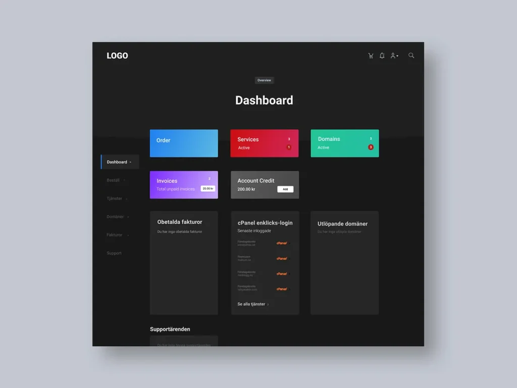
When designing dark UI dashboards, the same basic UX principles apply as in a light mode version. However, there are some tricks you can use for designing dark-mode dashboards.
In my example design above, you can observe some of these tricks:
- A dark background color combined with slightly lighter cards
- Colorful gradients to highlight areas, buttons, or graphs
- Strong colors in call-to-action buttons and icons
- Semi-transparent backgrounds
- Graphs that contain mostly grey data points, except for one or a few strongly coloured data points
- Light grey (and not 100% white) text
- Dark grey (and not 100% black) backgrounds
Mobile Dark Dashboard Design
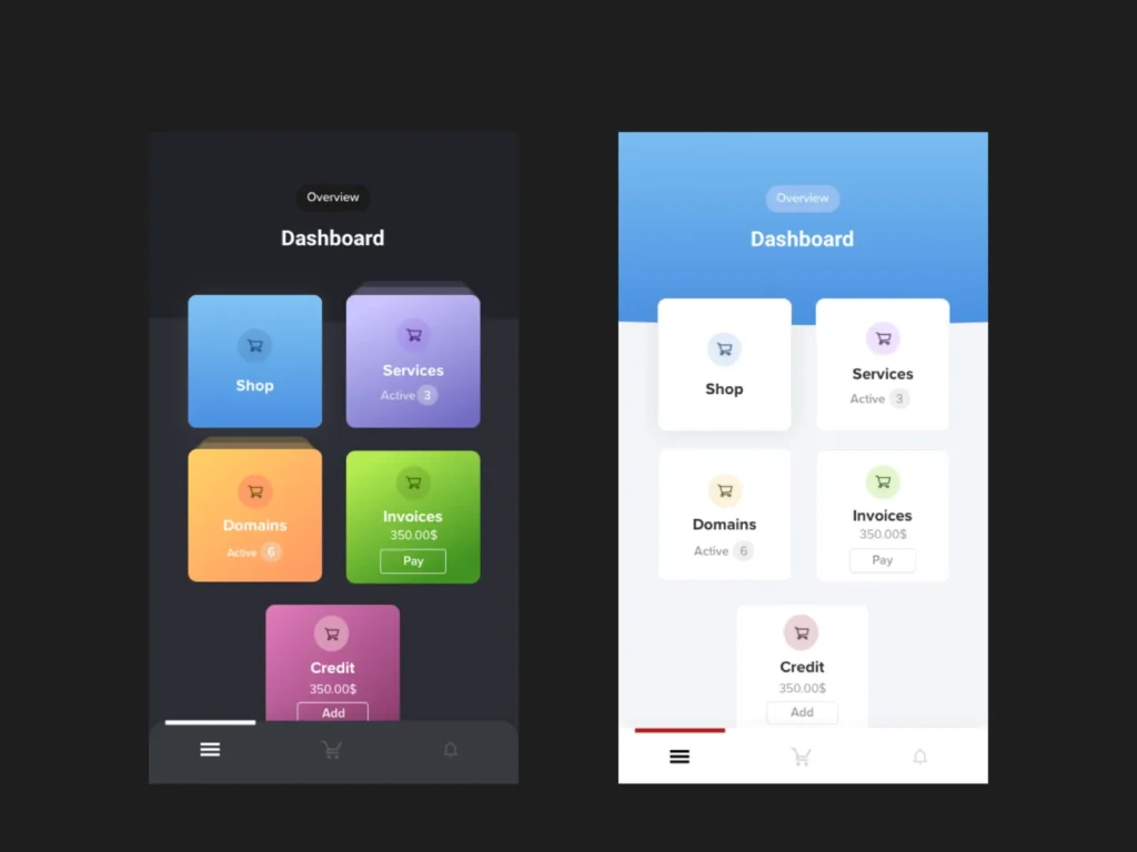
For mobile dashboards, keep in mind that mobile screens are smaller and can’t display as much information at once. This makes it important for dashboards to be responsive and allow users to reveal information progressively. In the above examples, I use cards to categorize information. Stacked cards can signal that there’s more information to be explored.
For example, you can construct the dashboard with cards and sections that can be flexed into the right positions. If you observe the following designs, you can see that they are all designed in sections or groups of elements.
Inspiration and Resources
For more inspiration, check out these design concepts.
- Ghulam Rasool
- Rafal Olbromski
- Amirbaqian
- Outcrowd
- Golo
- Tantriono
- AR Shakir
- UXDN
- Manuel Rovira
- Sèrgi Mi
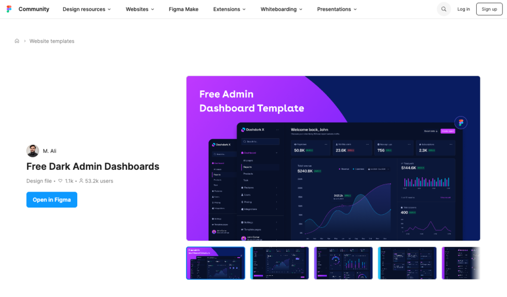
There are also free resources, for example, this one from the Figma Community files by M.Ali.
Design Elements
Lastly, here’s some inspiration for elements that you may include in your dark mode dashboard design.