
Here’s a collection of mobile dashboard UI design inspiration, examples, and tips!
Related: Dark Dashboard UI Design Inspiration
Tips
The biggest challenge with designing a good mobile dashboard UI design is the limited screen size. Dashboards usually need to contain lots of tables, lists, content, and. functionalities. On a mobile screen, the screen area can only fit so much.
But there are some methods you can use when designing mobile dashboard UIs, such as:
- Make expandable cards and lists
- Pick out the most important information and actions, and visually prioritize them
- Use hovering cards to show additional information
- Use tabs, both normal clickable ones and horizontal tabs (scrollable left and right)
- Hide some unimportant information and instead allow users to manually click (e.g. click on a point on a graph to show the exact number on that point)
Mobile Dashboard UI Design Inspiration & Examples
Here comes the visual inspiration and examples of mobile dashboard UI designs. I’ll point out some key points on some of them to observe and learn from.
Note! Some of these designs are not mine. Credits to each designer/owner are given below every image.
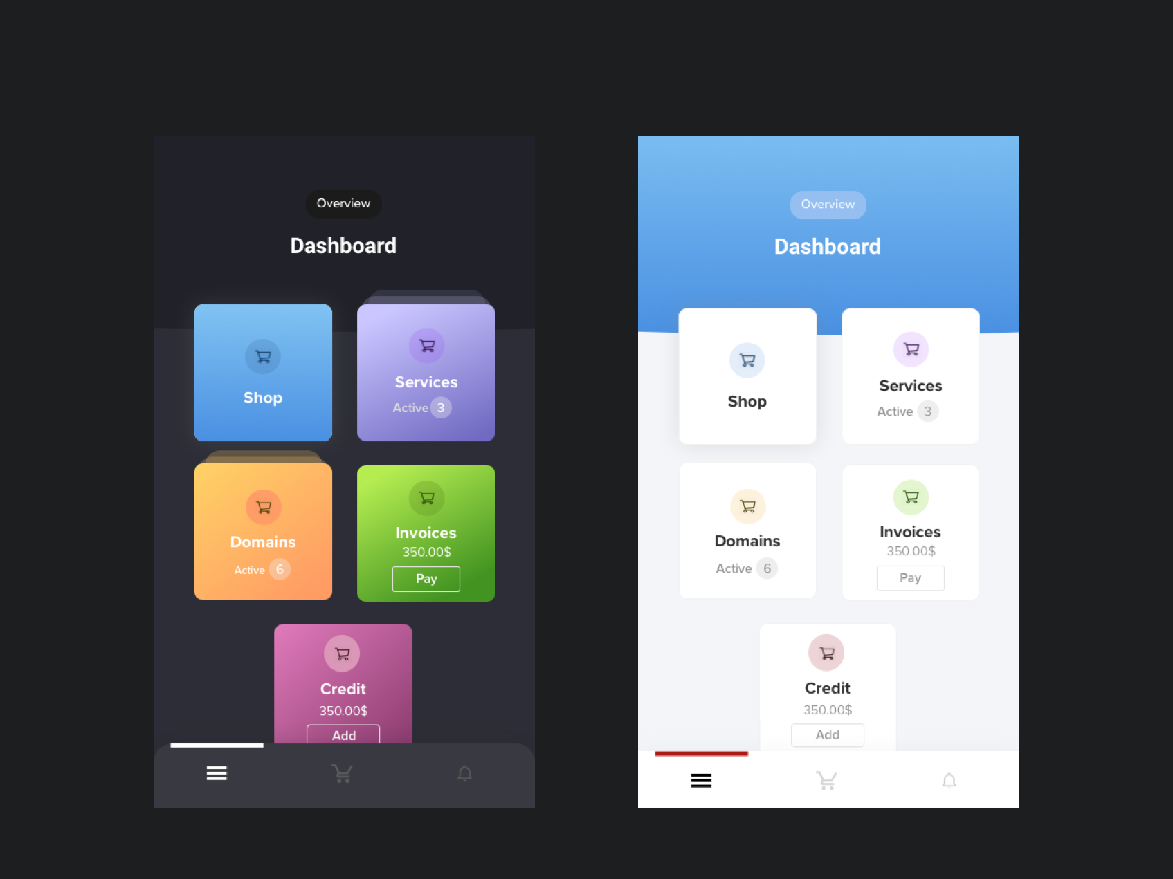
This first example is one of my designs. The main point is to give the user quick access to the five most important actions. In addition, there are some pieces of additional information on each card, so that the user doesn’t need to go further to get such information. For example, the amount left to pay on invoices.
I think this following design by Tran is gorgeous and so clean. It’s a great example of dark mode mobile dashboard UI design. Some details to notice are:
- The color of the icons on the middle screen is different for each card, making them visually distinct
- The progress bar is super minimalistic and fits great on a small mobile view
- There’s a consistency to all the card elements
- He has implemented tabs to split up information in different views (Middle screen tabs: Favorites, Recents, All)
- There’s a very minimalistic base design, but the added gradients makes it look fun and engaging anyway
DStudio has also done a great job. Some things to learn from:
- The most important information that the user may be interested in is displayed on the top (Total earning and the amount bigger than anything else)
- Here as well, you can see the effective use of cards and different colors to separate groups of information.
- On the right screen, there’s a horizontal tab component incorprated, which saves space but allows for more functionalities to be included
- There’s a footer-menu attached, which can be used when you want to hide but still include many functionalities
What a super clean design by Den Klenkov. Observe:
- The simplicity and generous whitespace used in all components. It makes the design look very airy, modern and fresh.
- The colorful card to the right, extremely dieted of information
Hope this was helpful!