
Neon colors and lights look so cool. If you’re passionate about futuristic interfaces like me you may enjoy these pieces of inspiration for neon UI design.
Credit to each designer is below every image.
Recommended: Cyberpunk UI Website Design Inspiration
How to incorporate neon elements
Since neon colors are super bright, and often look best on darker backgrounds, there are som common tricks that designers use. Some of these are…
- Use bright colors sparingly
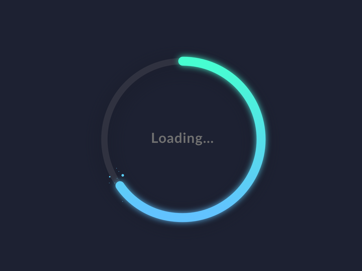
- Use neon colors for highlighting elements (icons, buttons, graphs, special numbers)
- Create engaging illustrations with the bright colors and keep other elements dark
- Use a glow shadow on the neon elements (the shadow color is the same as the element, and then add blur and spread)
- Use gradients between different shades of one color, or between different ones
Mobile App Interfaces
- Cyberpunk inspired neon UI design by Toma Li
- By Dash for UI8
- Left Aligned – A good example of how bright-colored illustrations stand out on the darker background.
- Offriginal for Orizon – High-fidelity mockup with neon colors and movement.
Desktop Interfaces
- Aleksandro – The bright colors are used to highlight the call-to-action button and the navigation menu to the left.
- Michael
- Awesomic – Bright colors used to highlight words in the title.
- Tomasz Osowski
- Tribhuvan
Neon Assets
Glowy graphs and buttons in bright neon colors.