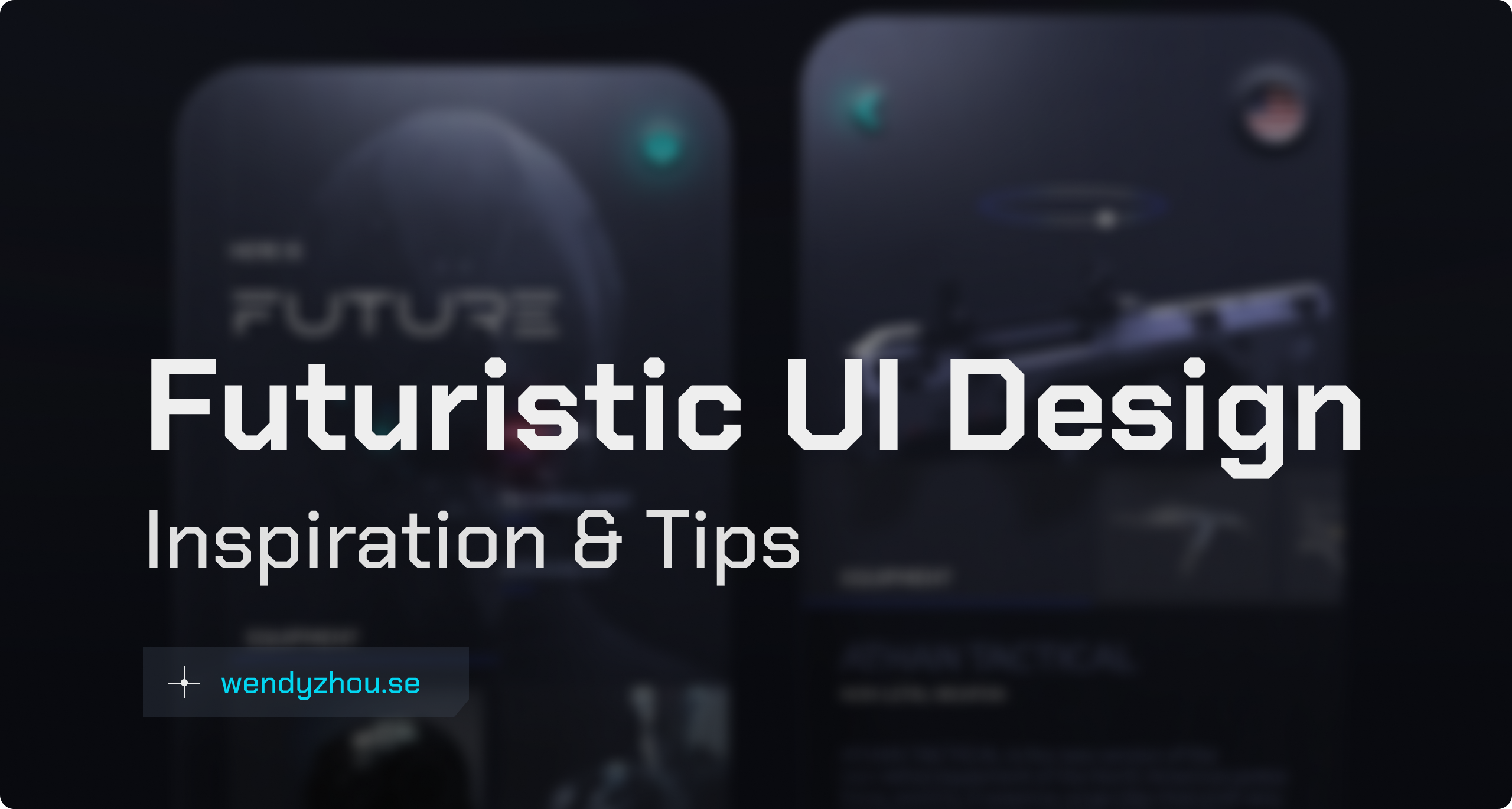
A collection of the best futuristic UI design inspiration (websites & apps) and tips on things to think about when designing futuristic UIs.
See also: Cyberpunk UI Website Design Inspiration
How to design a futuristic UI design
The easiest way to make UI design look futuristic is to take inspiration from things such as:
- Game GUIs (look for futuristic, sci-fi, and cyberpunk games such as Cyberpunk 2077)
- High-tech companies that aim to look futuristic (e.g., SpaceX, IBM Watson, Nasa Mars)
- Sci-fi and cyberpunk movies and art (See also: What is Cyberpunk Aesthetic?)
In my experience, there are two “looks” for futuristic UIs: dark and light modes.
- If you want a dark mode design, it works really well with the cyberpunk aesthetic, using dark base colors and highlighting details and text using brighter neon colors.
- If you instead want an airy, fresh, and light design, it works well to move towards a luxurious modern look; using a light-colored base and kinder colors (light blue, light gradients, and light grey boxes).
Certain UI elements make a design look futuristic:
- Highly decorative display fonts for headings, combined with super minimalistic sans-serif fonts for body text
- Glitches
- Sharp cut-off corners
- AR (augmented reality) and VR (virtual reality) scenes
- Highly polished animations and 3D models
- Voice assistant interfaces
For inspiring designers who work in a futuristic UI design style, see
I post some futuristic-looking graphics on my Instagram as well.
Futuristic Website UI Design
Isn’t it always more fun to look at real-life examples? So, let’s dive into great futuristic website designs and analyze what makes them look futuristic
Cyberpunk.net
The official website of Cyberpunk 2077 is, in my opinion, one of the most futuristic and creatively designed, and coded websites on the internet. It’s pretty hard to create all the cyberpunk UI elements in code (as I’ve tried many times myself on this website). So, I am really amazed by all the small UI details that they’ve successfully implemented.
For example, look at the cut-off corners on buttons and the menu, and the glitch effect in the hero section.
Teslacybertruck.com
One of the best futuristic websites is the marketing website for the Tesla Cybertruck. This is a more minimal and corporate style than the cyberpunk.net website, and tailors to a different audience, yet it is still futuristic.
We can observe the game-inspired GUI elements and how futuristic imagery takes up a lot of the visual space. It also has that minimal sans-serif font in a thin style. You can also see the cut-off corners of UI cards and the minimal dark aesthetic.
The challenge with creating real websites with futuristic UIs is the technical challenges and limitations. There are people who work as creative coders who specialize in turning artsy design into code, but it’s a fairly new niche. And there’s also the challenge with how to make very creative and artsy designs responsive (adapt the content between different screen sizes such as desktop and mobile screens for example). A company also often wants all potential customers to be able to use their websites, and for example not just someone who sits on the high-tech computer with all updated software and all necessary frameworks installed.
Fun fact: From what I’ve read, when it comes to creating more innovative web design today, people are often using illustrations (in SVG formats) that are then put onto the website. SVGs are scalable in a nice way, and so they work great for creating responsive websites.
Thanks for reading! I hope this could give you some good inspiration.