Here’s a collection of inspiration for minimalist blog UI designs! I’ve included inspiration for both mobile and desktop screens, as well as some practical design tips on how to get the minimalist blog look.
Most importantly, to achieve a minimalist blog UI design, it’s important to let the content (images & text) take the center place. This means for example to not having a too distracting background or too much visual clutter around the main content. This also means for example to avoid a multi-colored color palette and instead keep the design to neutral colors. Having enough whitespace (created using enough margin and padding) is also very important to make the design look minimalistic and clean.
Note! When I write inspiration posts like these, many of the designs are not mine. So, credits are given to each designer below every image.
Related: Form UI Design Inspiration & Tips
Minimalist Desktop Blog Design
Let’s start off with some minimalist design ideas for desktop screens.
The Front Page
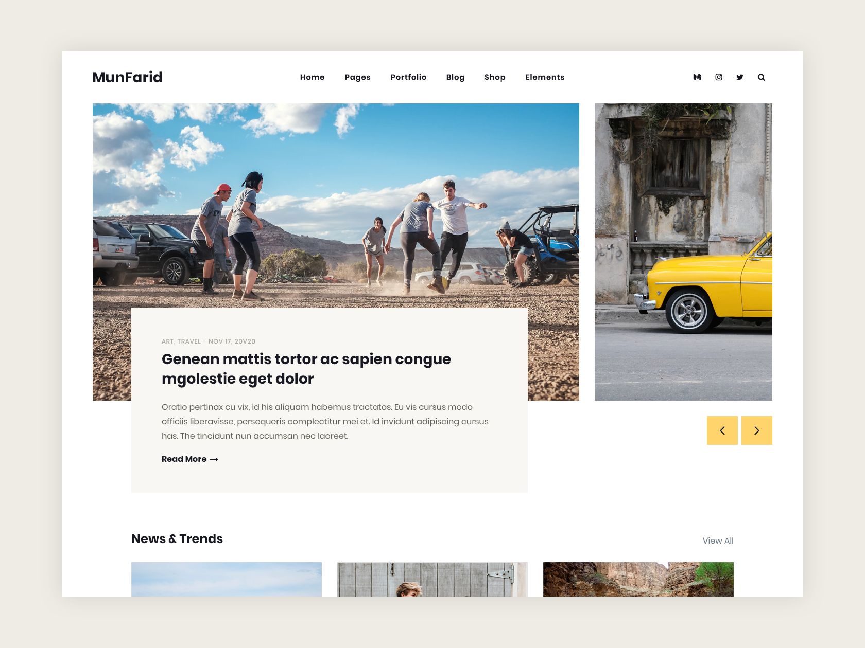
The front page is the landing page of the blog. On the front page, there’s usually a display of many recent blog posts and featured posts. So most of the time, this means that the front page needs to be able to display lots of textual and visual content, without looking too cluttered. The best tip I have for achieving a minimalist front page on a blog is to keep the header and background very simple and in a repeating pattern, as well as to use a minimalist font (e.g. sans-serif, a modern looking one, or something that doesn’t look too artsy).

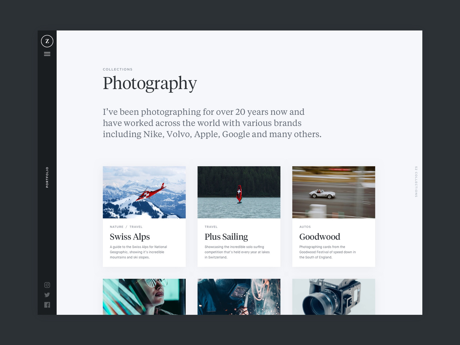
Working with some CSS flexbox can be a great idea.

Single Post Page
A single post page is a view you get once you’re “in” an article.
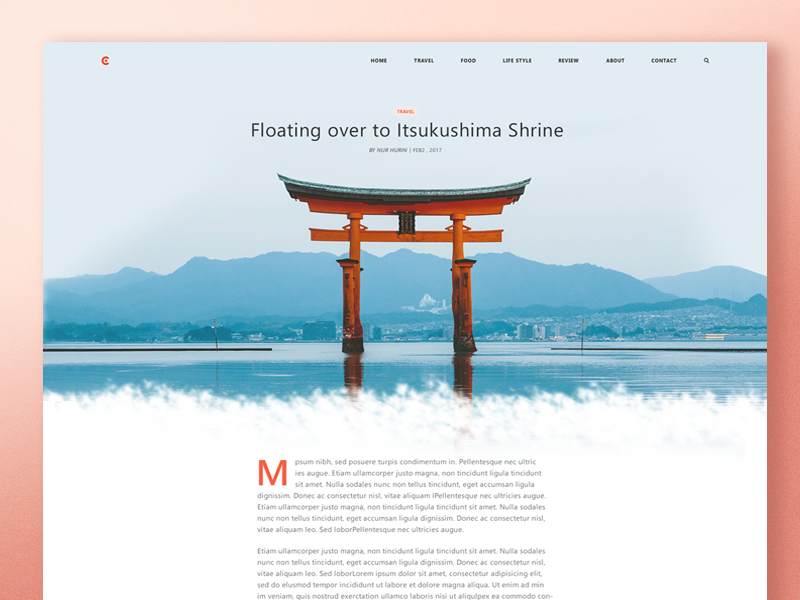
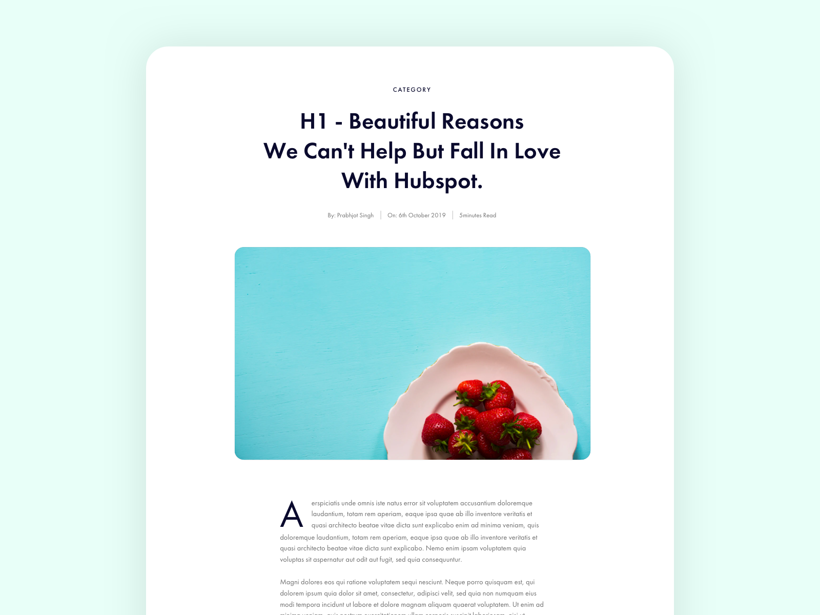
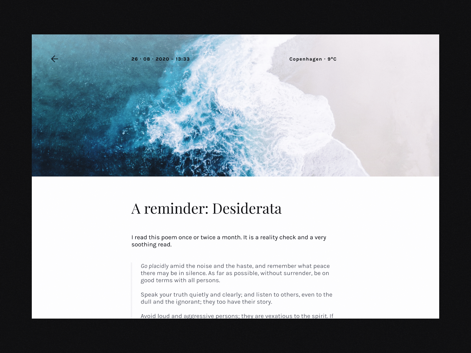
One key design trick to achieve a minimalist blog design is to use huge thumbnail images at the top of the blog posts. This makes the page much more interesting and engaging, especially when the rest of the design is very minimalistic. And in addition to this, you can use a big font size for the main header to achieve a satisfying visual hierarchy (the most important things are the biggest, and less important things are smaller and less visible).
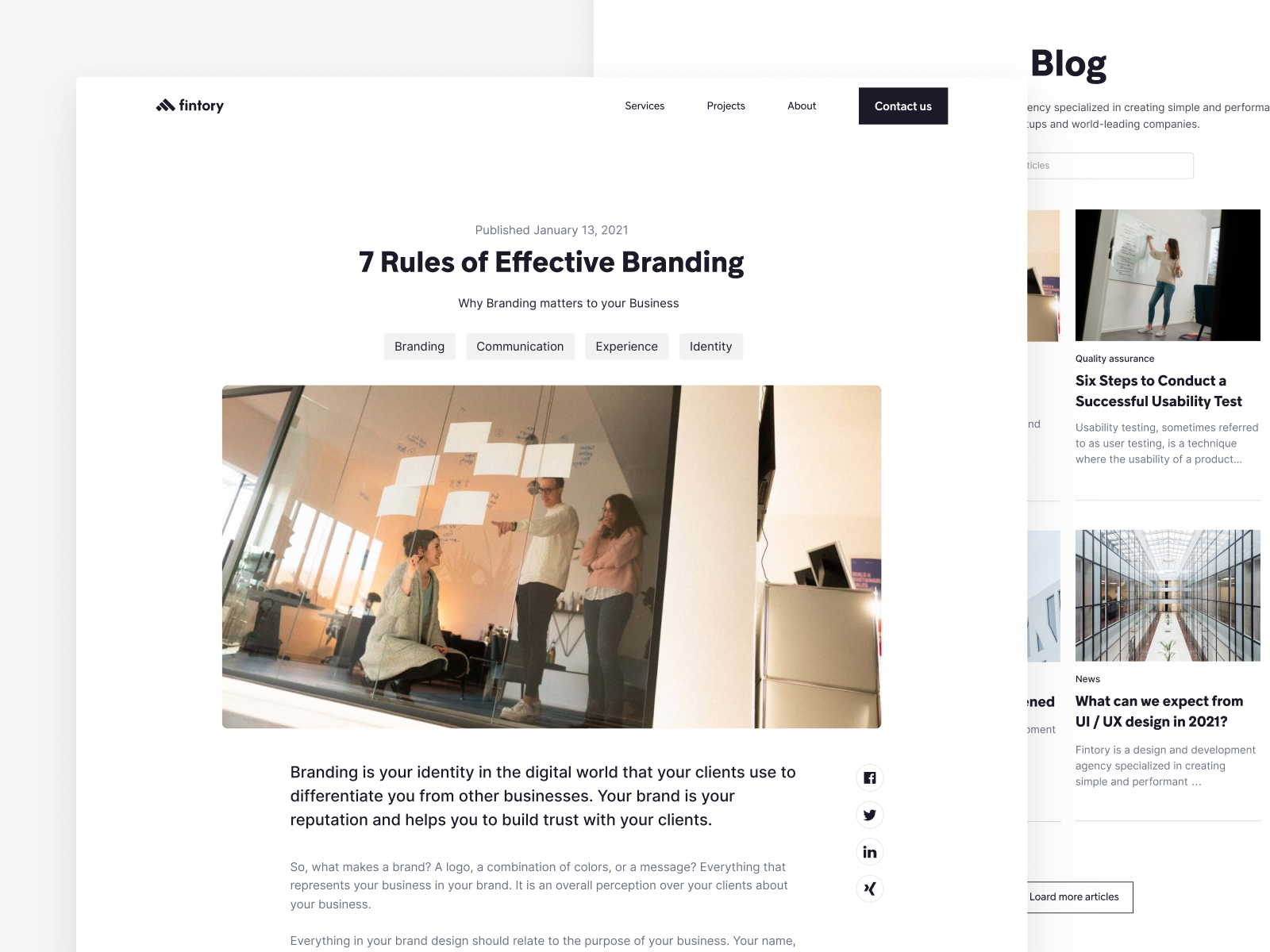
Most minimalist blog designs also hide the sidebar while on a single post page, to allow the content the user’s full attention. However, the drawback of hiding the sidebar is that it doesn’t nudge the user/reader to continue exploring the blog. So keeping the sidebar may make the design less minimalistic, but may up the time users stay on the blog.
Another trick is to make meta-data such as categories, author name, and date, less visually distinct by using lower-contrast font colors and sizes. But of course, in some cases, it may not be a good idea to make the author’s name too hidden, since it’s important to give fair credit when it’s due.
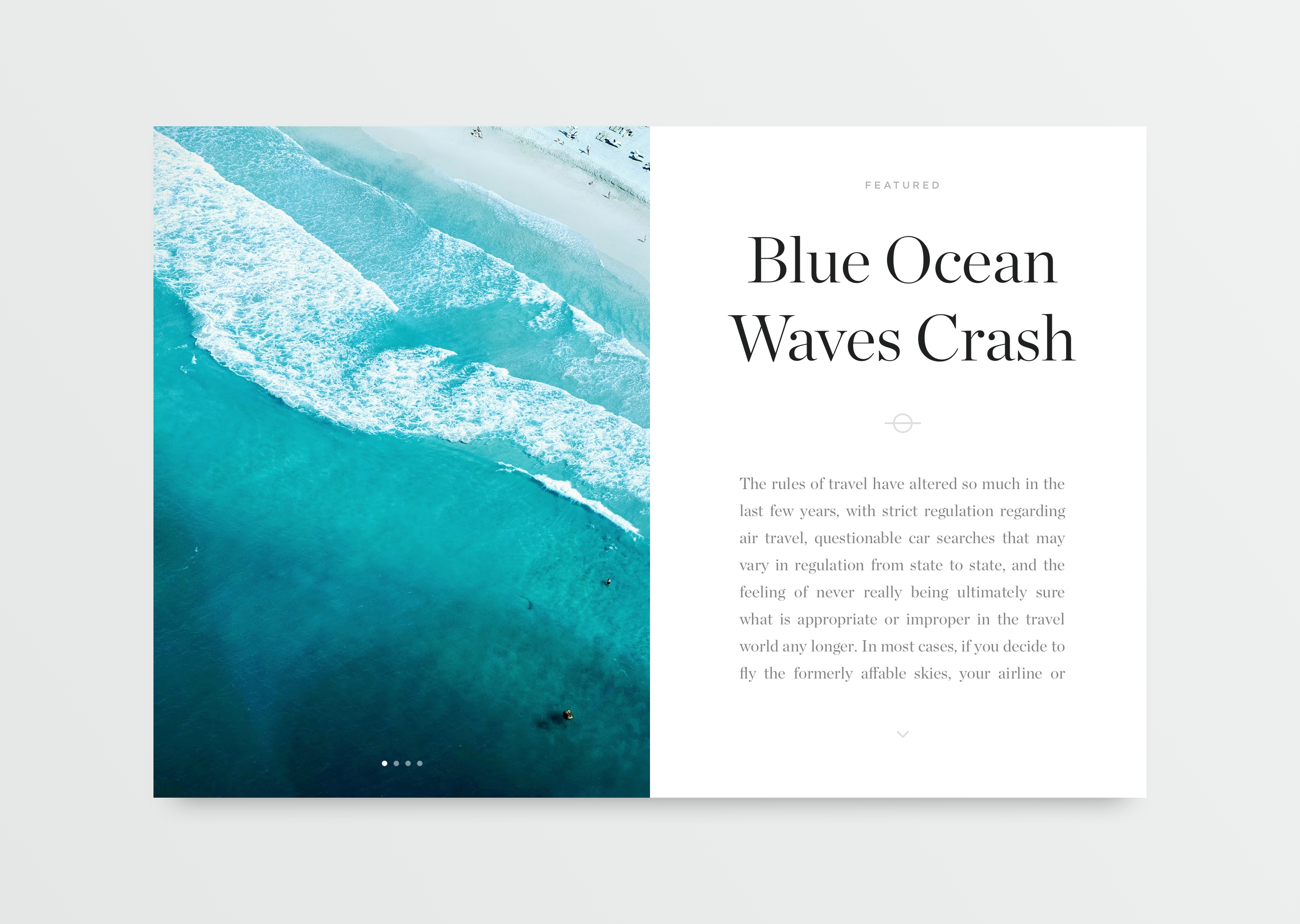
This one by Oliur is an interesting one. Oliur has decided to cut off the blog post in two sections. The left part can then be used to display a slideshow of images, while the right part is where the textual content is displayed. I think this is a design that would work great on an app that the user downloads onto their computers, but may be a bit harder to make responsive as a website design.
Minimalistic Mobile Blog UI Design
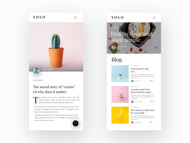
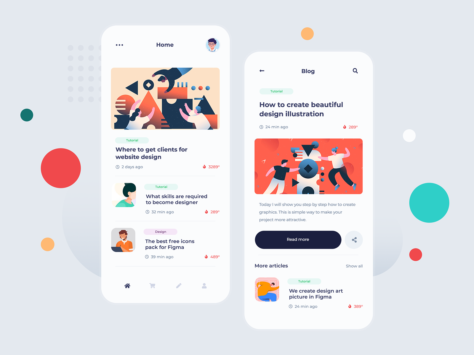
For mobile screens, a minimalist blog UI design typically needs to put more weight on the typography to still make the design engaging. This is because compared to desktop screens, the thumbnail images are limited to a certain size and won’t give as much of an impression. So, the header for example may need to take the lead on engaging the user.
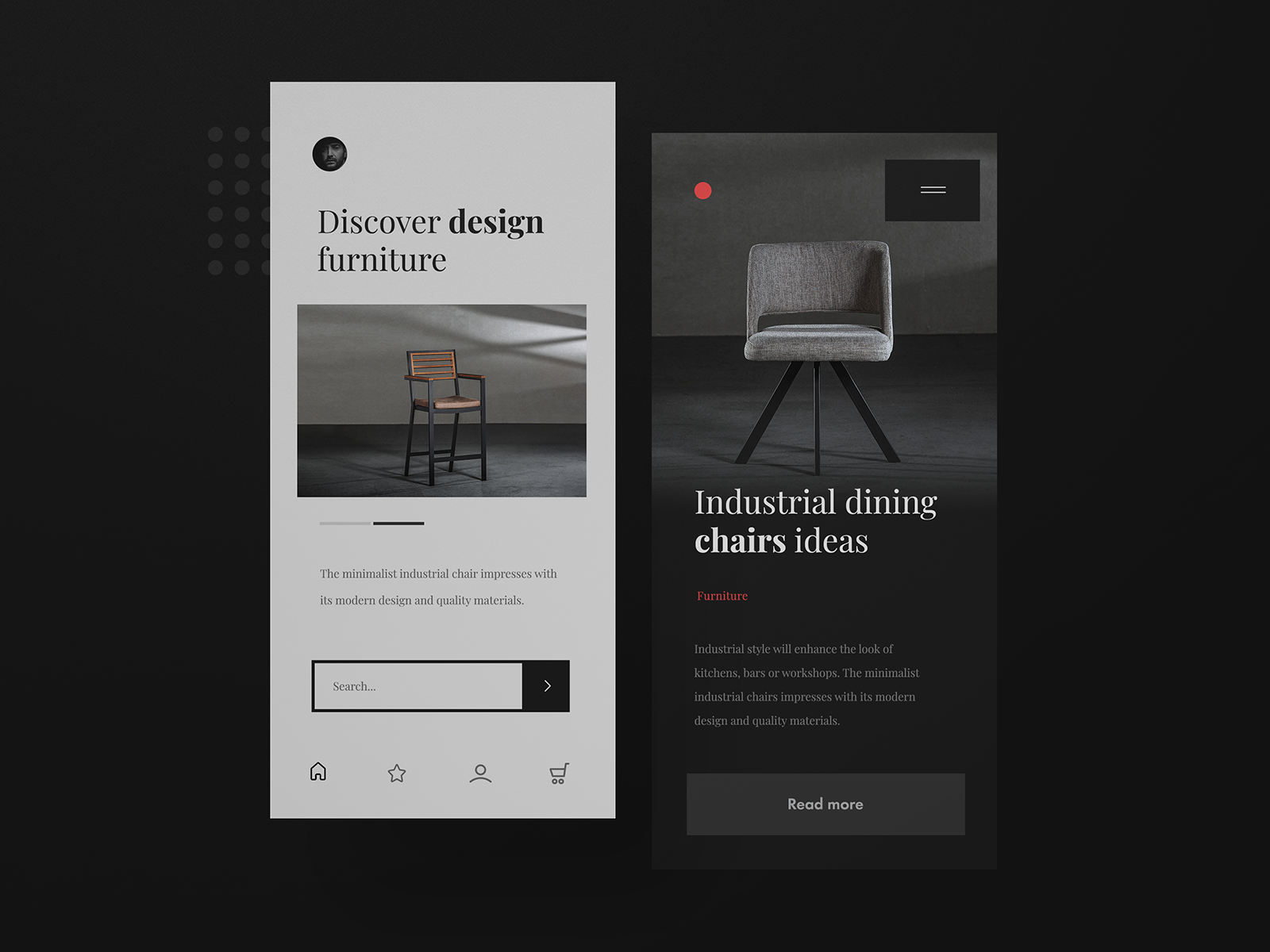
This design below by Adam Kozel is a great example of how one can use typography to make a minimalistic design more engaging, without using too colorful imagery or illustrations. Note how the metadata is in red color, but you may as well flip them and make the header in an attention-grabbing color. In addition, note the amount of whitespace he has created around the top section of the design. This makes the design look very breathable and airy, which is associated with minimalist designs.
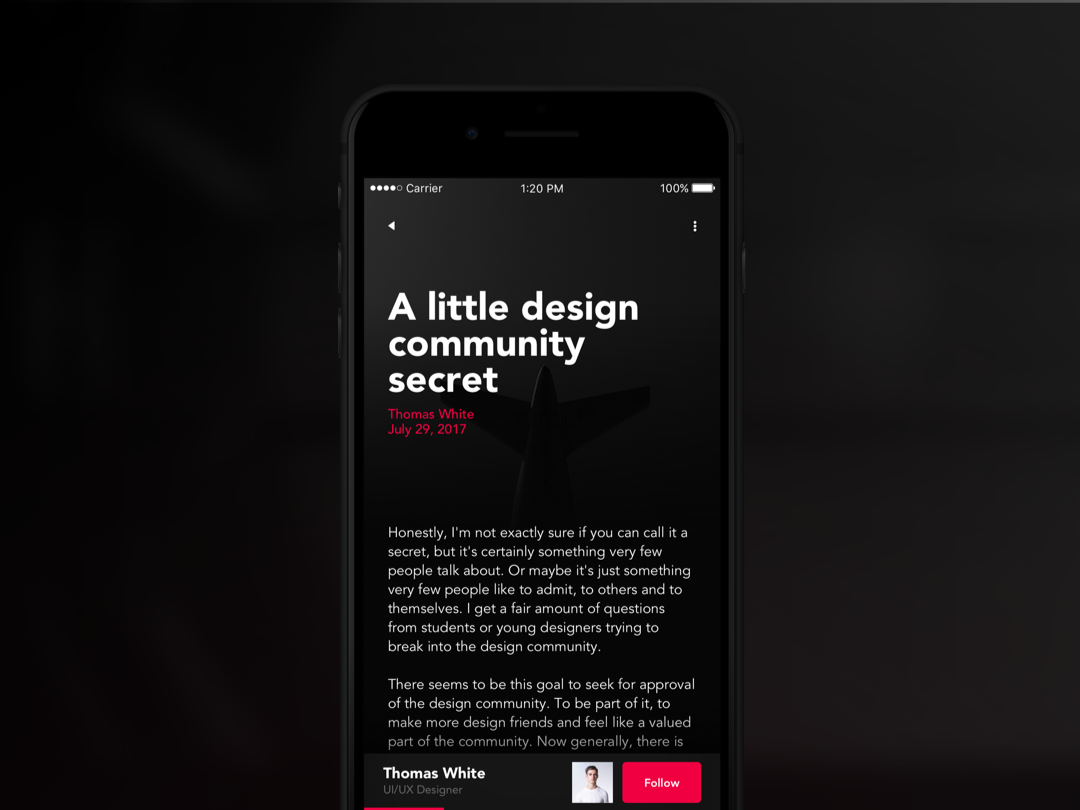
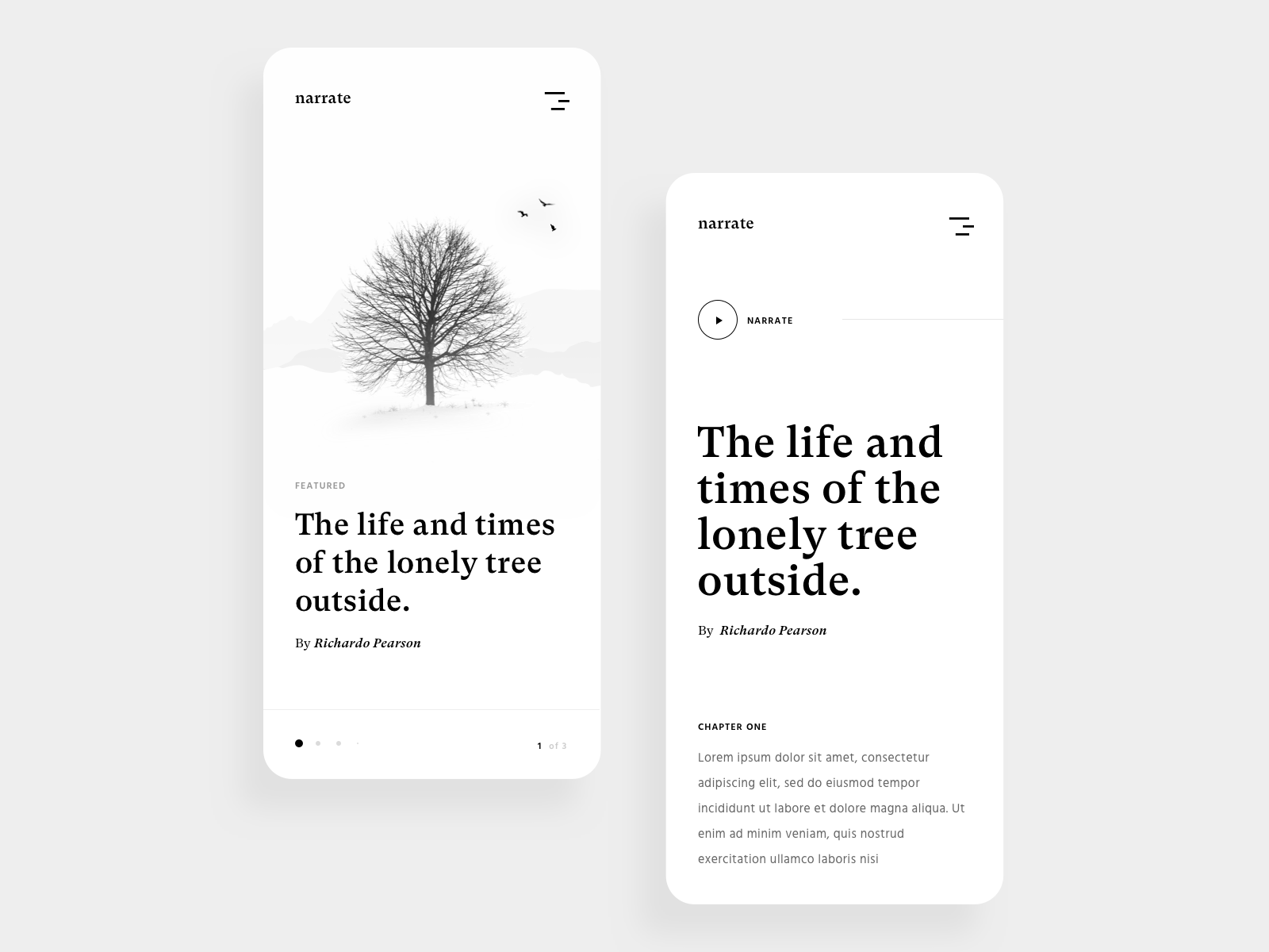
Some other tips when designing a minimalist blog design are…
- Make the body/paragraph text lighter (less contrast), so that it looks softer
- Use a minimalist and modern font
- Make buttons and labels minimalistic as well, instead of colorful and attention-grabbig (although, perhaps not on important call-to-action buttons)
- Use enough padding and margins. Make the design breathable, which makes it look more minimalistic
Thank you for reading, and I hope you enjoyed it!
Recommendation for further reading: Music Player UI Design Inspiration
