This is the process of how I design complex custom UI Illustrations. It’s a good skill to have to be able to contribute more.
My thoughts
Recently, I’ve been exploring my skills in how I design complex custom illustrations aimed at technology and IT. I wanted to share with you how my design process is when creating such complex illustrations.
I’ve always spent much time drawing and painting since I was really young, but creating custom illustrations for abstract IT terms and systems is much different than the types of drawings I’m used to doing. For example, how would one go about creating an illustration for a website that sells a “Site Builder” without using a screenshot of the service itself?
This is actually one of the illustrations I made at work recently, so let’s use that one as an example.
Disclaimer! With complex illustrations, I mean anything that isn’t a simple and straightforward object. For example, a simple illustration would be a cloud, a book, a pencil. A complex illustration would be something that represents security, social media, education, and so on.
My Design Process When I Design Complex Custom UI Illustrations
My process is usually as follows
- Brainstorm ideas with words in a long list/on paper. All the things my brain thinks of automatically when hearing the word/idea/concept.
- Narrow down the list to concrete keywords/items.
- Sketch out the items in lo-fi versions, and try to create different versions of them.
- Look up inspiration from others (don’t copy others’ work straight off, but you can copy the essential idea)
- Scan my sketches into Sketch (or Illustrator or Affinity Designer).
- Make lo-fi vector versions of my sketches. Ask for feedback and iterate.
- Play around and explore different combinations and layouts of the elements. Ask for feedback and iterate.
- Color the illustration.
So, in a real-life example using my work on a “Site Builder Illustration”…
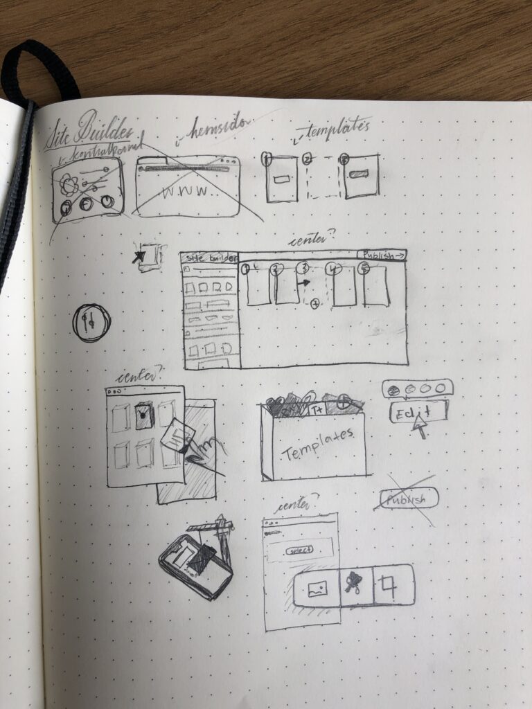
Early step: Sketches on paper
Below are some of the early sketches I did to explore how my keywords (steps 2-3) could look. I crossed out some as soon as I finished them because they felt wrong. I also note down some thoughts I have, for example, “center?” in my notes means that I’m exploring the idea whether that graphical piece should be the center of the illustration.
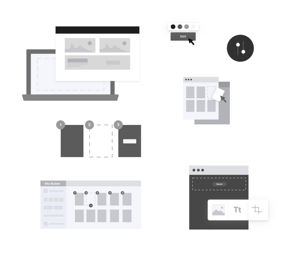
Middle step: Lo-fi vector shapes of the elements
Here are some of the vector shapes I did of the elements seen on the sketches in the previous steps. I work on a grey-scale to not get stuck on details. On this step, it’s important for me not to be too attached to my ideas so that I can eliminate the ones that aren’t that good. Sometimes I ask for feedback on this step to make sure that I’m on the right track.
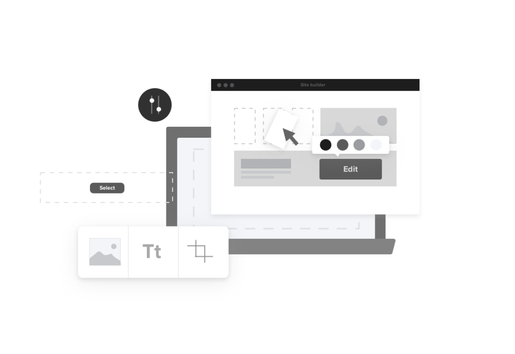
Middle step: Exploring the layout of the illustration
Next, I combine the elements into a bigger picture. I explore which elements should be included, which ones should be central pieces, and how the composition should look. Most of the time I do a lot of different variations, but here are two of them. At this step, I usually ask for feedback from stakeholders so that I don’t spend too much time on coloring and details only to find out that they aren’t satisfied with the concept. I don’t show them all of my ideas, but only 2-4 that I think are the best. If they don’t like it, then I continue exploring more ideas.
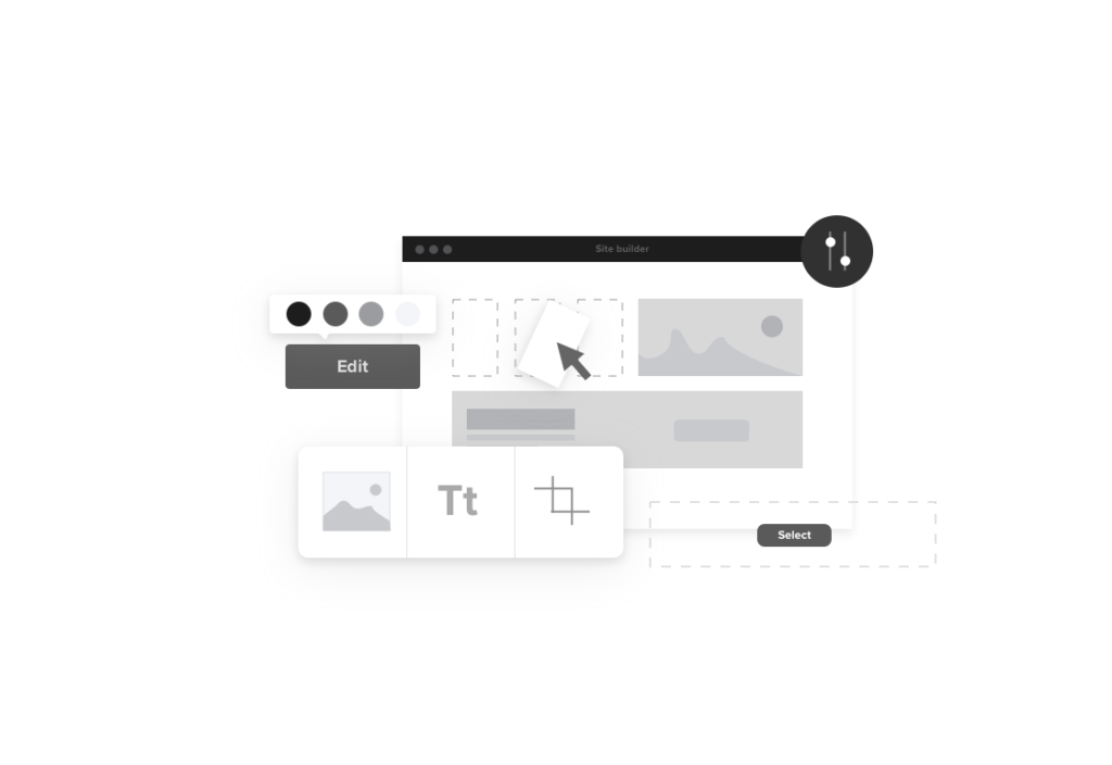
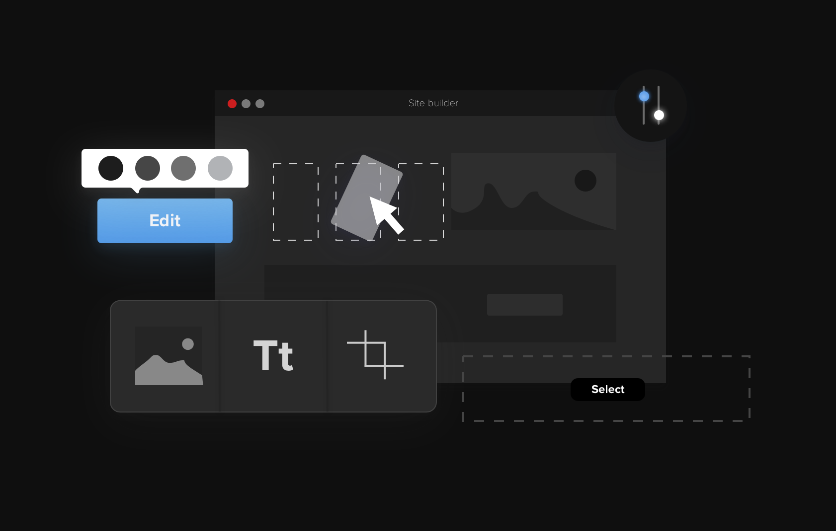
Last step: Details and colors of the illustration
When a concept has been improved, I begin coloring and working on the details of an illustration. Here I need to work with the company’s brand colors and what they’re looking for. Sometimes it may not be exactly aligned with your personal style, but that’s a part of the job, to be able to design from your client’s wants.
If I need visual UI inspiration, I usually go visit Dribbble.
The important thing for me when doing an illustration for someone else is that they are satisfied and feel that I’ve delivered what they were looking for.
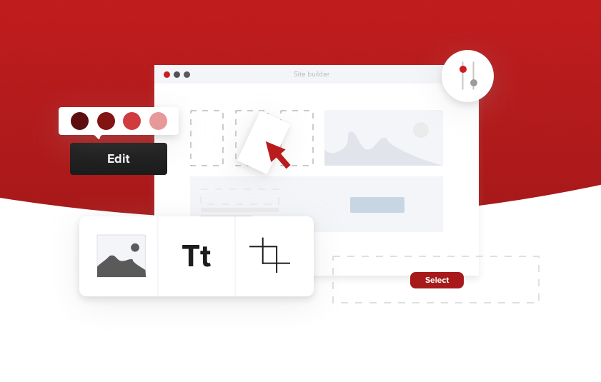
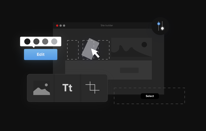
If I were to color this illustration however I wanted, I would do it as shown below.
I hope this article was insightful!
More UX & UI design articles
If you’re interested in reading more articles about UX & UI design, you can check out my related posts: