
The calendar UI component isn’t very popular to post on social media. But people who work with UI design for non-flashy products may very well encounter a situation where a calendar component needs or should be designed. To help you out, I’ve collected this set of calendar UI design inspirations (or date pickers), as well as some UX lessons and thoughts to go with it.
Note! Not all of these are my designs, so credits are given to each designer under every image.
Related: Chat Screen UI Inspiration | Mobile, Desktop & Video Calls
UX Lessons & Examples
When designing a calendar UI component, the hard part is how to show the user feedback on their choices, and how to allow for dynamic interaction (for example, changing chosen dates). There’s a lot of interaction design that goes into a well-designed UI calendar.
These challenges are especially prevalent in regards to designing calendars where users are choosing an interval, with a start date, and end date.
For example, how do we visually show the user which/what date is…
- selected? (Selected state)
- unselected? (Inactive state)
- unavailable? (Blocked state)
- about-to-be selected (Hovered state)
- highlighted? (For example cheapest or most expensive dates)
Oftentimes, the design-thinking needs to enter even before the user has made its first action.
And to make it even more difficult, there are restrictions such as different screen sizes, as well as for example the inability to drag and hover on mobile screens and tablets, which you can do on computers. Will you for example need to create different versions for mobile vs desktop? Or allow users to choose to see a more advanced version?
So, when designing UI components like these, may need to really cut down on what features are necessary to include, and which can be cut out. Or, perhaps, you need to incorporate the UI parts outside of the calendar, to aid the user.
One thing is for sure in my experience; if you want to design a great user experience, you’ll need to carry out usability tests with users to find out what works and what doesn’t.
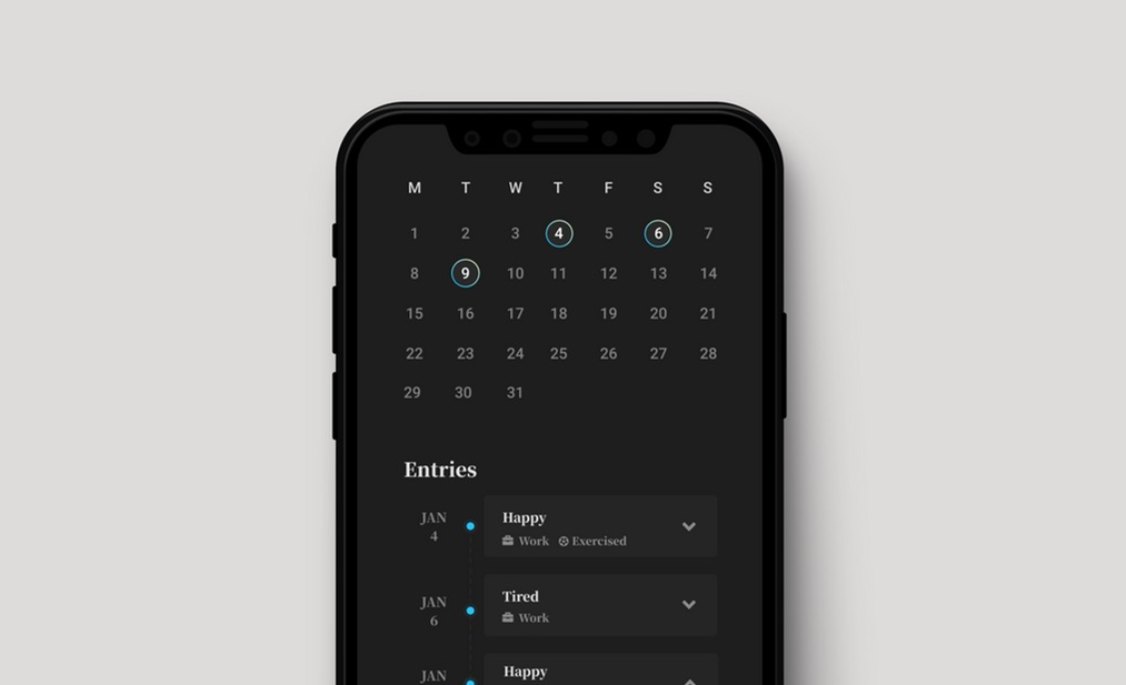
Calendar UI design Inspiration
- Meeting Modal Creator by Michal Parulski – This first one has some gorgeous animations for the interactions, and I enjoy the dark-mode style as well. It’s a nice example of another scenario where calendars need to be used: for planning. A small (and nice) detail in this design is how it shows the user on what dates there already are events scheduled, and what color they have.
- Date Picker Dona App by Jakub Antalik – This is a quite simple date picker/calendar, but it’s very clear and has some interesting UI details. For example, Jakub has placed quick choices on the top bar “Today / Tomorrow / In 2 days”. When applied in the right contexts, such shortcuts can really elevate the user experience. Another detail I enjoy with this design is the inner-shadow on the selected state (if you look closely), which reminds me of Google’s material design. It also has a very soft shadow below it. I also really like the low-opacity blue border on the hovered state.
- Free Date Picker Figma Component by Orman Clark – This is a free calendar UI kit in Figma (link), that is responsive, is built with auto layout, components, variants, and light and dark mode. Awesome work by Orman, and so nice that he’s sharing it for free!
- Dashboard Meeting by DStudio – This is another example of a calendar UI component that includes more features than date-picking. This calendar focuses on using a calendar to display planned events. It’s interesting because it displays both events that only take place during one day, as well as events that span over multiple days.
Here’s a couple of other UI date pickers and calendars with beautiful visual design
- Afshin T2Y
- Emiliano Cicero – An interesting behind-the-scene of building a date-picker – I can relate to how much work sometimes needs to be done on creating the right paddings, margins, components, responsiveness, and auto-layouts.
Thanks for reading! I hope this was helpful to you.