Here is a curation of the best search UI design inspiration, as well as practical tips and lessons to think about when you design your search UI component.
The search UI design component is seemingly invisible. Most people don’t stop to think about how prevalent it is, but it’s everywhere. It’s in almost every interface, whether that be a website, app, or system. Sometimes it’s in plain sight, sometimes it’s hidden, but it’s almost always there.
Some sites, such as Google and other search engines, as well as marketplaces, are built around the main search UI component of the page. Even sites that are built around other functionalities, almost always need to include a search box to help users navigate and find hidden pages.
Why the search UI design component is so effective
A search UI design component can be used for countless different purposes and functionalities, including, but not limited to:
- Allow users to filter information
- Allow users to find hidden content (not everything can be displayed on the viewable screen)
- Improves user experience by saving user’s from needing to read, search, navigate the mouse, click around, and go on a treasure hunt to find what they’re looking for
- Universal: The search box is so common that it’s a design convention. Everyone knows how to use a search box. It’s intuitive and easy to use for all types of users (including those not well-versed with digital interfaces)
- Mediate between user wants and business objectives: Allows the user to access the content they seek, that businesses may not want to directly promote
In addition, while the rounded or square search input-field often takes a very simple and conventional look, you can still add lots of functionalities. For example, you may apply a drop-down to the side with additional functionalities.
How to design an advanced & complex search UI
Let’s take a look at some search UI design inspiration, and go through possible alterations and additions that you can add onto a search component.
1. The Minimalist Search UI Design
The simple input-field is the easiest part of the design. It’s just a rectangle with rounded corners, a guiding place-holder text, and one or two buttons/drop-downs on either side.
Google’s Minimalist search UI component
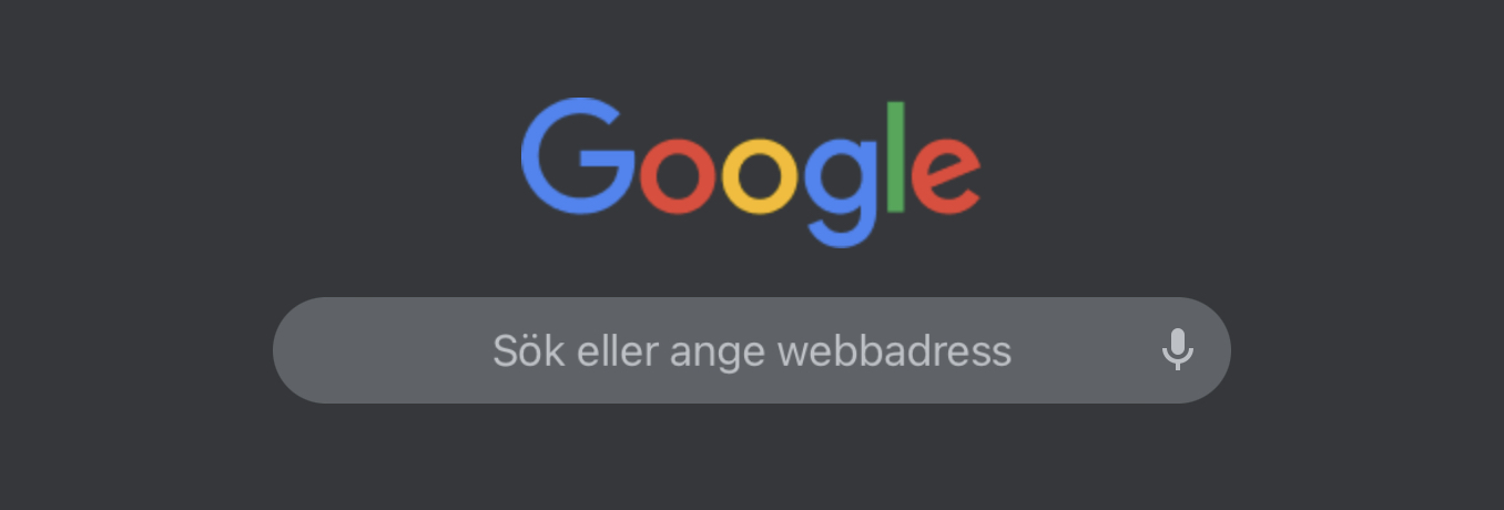
The image above is an example of Google’s extremely stripped-down and minimalist search UI design component. The search component only has an input box and a placeholder text that guides the user on what to input.
Interestingly, it doesn’t even have a “Search” or Go-forward button nor any additional filters. Google may have made their search UI component so simplistic because they assume that their user’s already know that they can go forwards by clicking “Enter” on their keyboards.
Perhaps they also trust that their search results are so intelligent, that people don’t need to use any filters.
Amazon’s & Dribbble’s Normal simple search component
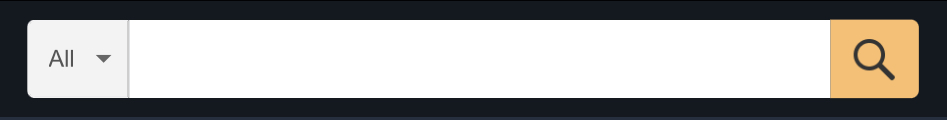
Amazon has a little bit more explicit UI design to their search field. It also of course has the input field, but they also have an explicit “Search”/Enter button to the right.
This is probably one of the most conventional search UI component designs. Not only is it simple, but it doesn’t even assume that users know that clicking on entering on their keyboards will move them forward.
Observe that it also includes a quick filter to the left, so that users can filter the type of results they’re looking for, even before generating results.
Dribbble’s search component is pretty similar. They do not have the explicit “Search” button though but do include a filter as well.
2. Additional Settings & Filters to Search Component
Next, let’s look at the bigger image. Some search functionalities or pages are dedicated to searching, and they incorporate lots of more filters.
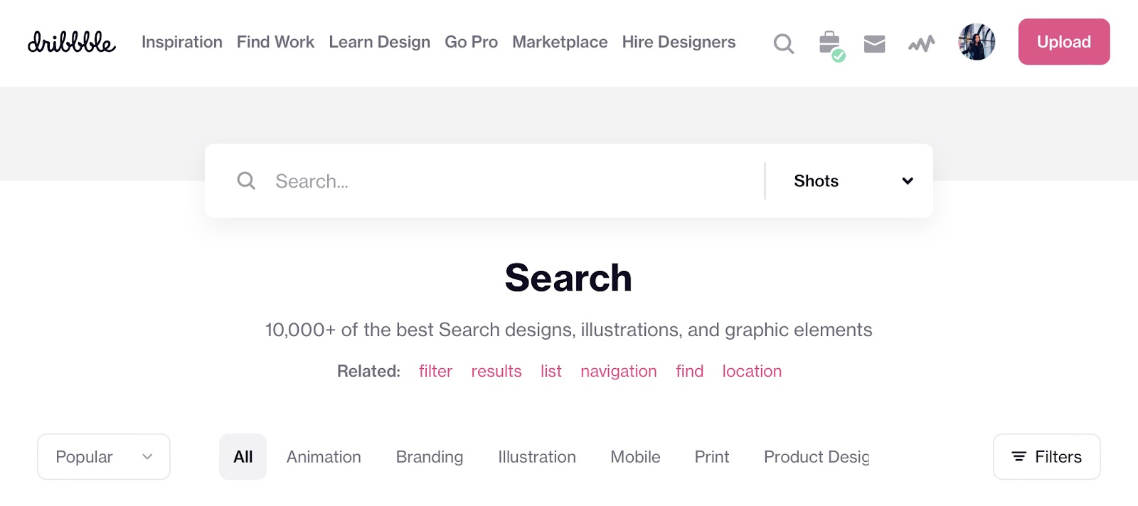
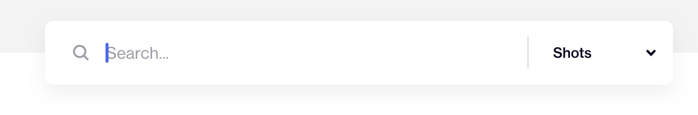
Let’s look at Dribbble’s site again. When you zoom out from the search input field, you see that there are lots of additional settings to the search page.
For example, you can click on “Related”, which suggests things users might be interested in as well. Probably generated by some smart system that analyses search data.
In addition, you can click on “Popular” (and choose between Following, Popular, New & Noteworthy, as well as Goods for Sale). To the right, you can also click on “Filters”, which will fold out a ton of different options (see screenshot below).
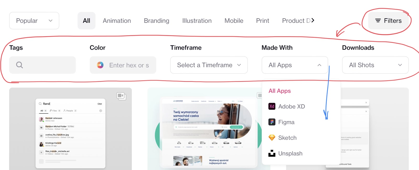
Already here, you can see the difference between a simple input field that only generates results based on word matches, and an advanced search design that allows for much more functionalities. Most often such functionalities have to do with filters, checkboxes and suggestions.
The point of showing this was to illustrate how versatile such a seemingly straightforward UI component can be.
Exactly what your design would benefit from including, is dependent on the goals of the product/system you’re designing.
How to think + Practical tips
When you have designed elements such as these a few times, you’ll get better at generating ideas about what may be suitable. But if you have no idea how to start thinking, here are some starting points you can go from.
- Determine what the primary use is of the search component
- Which are the user’s primary wants?
- Which are the business/creators’ primary wants?
- Is there a way you can combine these things (if they are different)?
- Talk to developers (if this is going to be implemented in a real product)
- What is possible or reasonable to develop search-wise during the time and budget you have?
- Sometimes the ideal vision of what we’d want to design and create doesn’t go hand-in-hand with what we actually can afford. Perhaps we may need to prioritize
- Take inspiration from competitors.
- Do you have any competitors that already have implemented a similar type of functionality?
- Is there anything there you think your users would benefit from as well?
- I do not mean for you to steal, but you can take inspiration from ideas
- Following this, I’d advise you to go further than what your source of inspiration has gone. Make your version even better than that of what you got inspiration from
- This is the way that design and software functionalities develop and become more impressive every year. And you, as a designer, could be proud of any innovative solutions you may come up with
- After having generated a concept for the design, perform usability tests on users to see if there are any problem areas or usability problems that need to be fixed. And perhaps your users may even have good suggestions on what they’d want to have in addition
These steps are valuable in general when designing all types of digital components. So, the most important thing I think you should take away from this article is this way of thinking about design and idea generation.
Thanks for reading! I hope this could help you. If you’re interesting in reading more like this, here’s a few other ones I’ve written: