This article will teach you how to design good form UX/UI design.
On dribbble you can see that designers enjoy creating landing pages, dashboards, social media feeds, and other existing stuff for practice. Those things can look good by just adding pictures and gradients. I do that too. But…
I also think that it’s important to practice designing non-existing elements, but that is highly used. For example forms, email templates, check-out processes, and invoices.
On one hand, I don’t have a choice in doing it because those are things I need to design at work. But I also understand that those things need to be designed well since those are the UI components that users interact with the most.
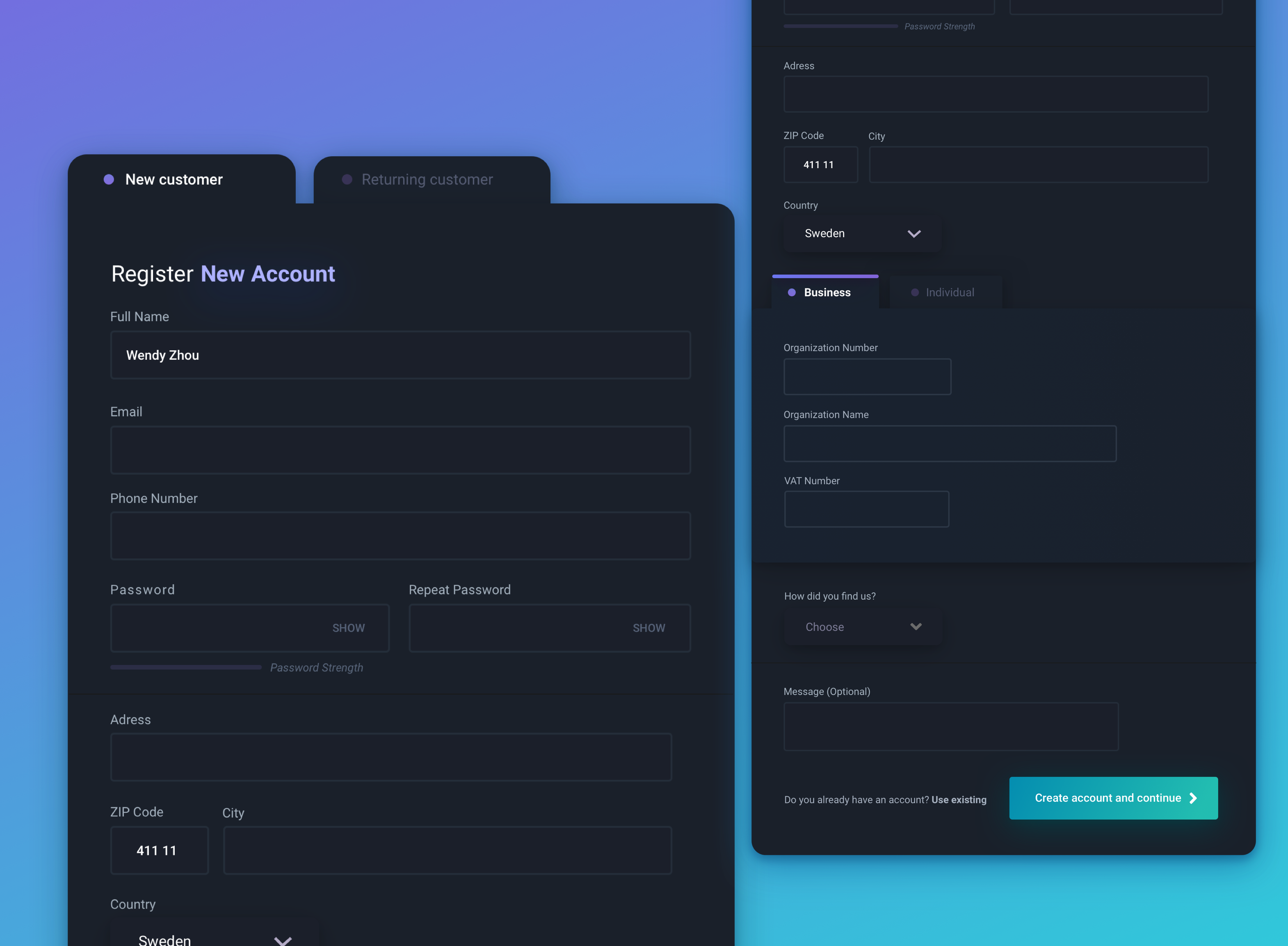
Forms are one of the things that are everywhere on the web and usually very boring to fill out. So with this design, I tried to make a form with great usability and tried to make it fun while still keeping all the essential form fields. So.. Here are my guidelines for creating good form UX/UI design.
Guidelines for designing good form UX/UI design
To make the usability of the form as good as possible I implemented multiple UX guidelines for form design which I found in the following articles:
- Design better Forms by Andrew Coyle
- 7 Best UX Practices for Designing Long Online Forms by Ashlyn Baum
- 16 Tips that Will Improve Any Online Form by DKO
Guidelines
- Keep form fields on one column as much as possible (except for forms that are highly relevant like password and repeat password).
- Top align labels.
- Make the Call-to-action button descriptive.
- Use field lengths as an affordance.
- Groupe relevant information.
Accessibility & Light mode version
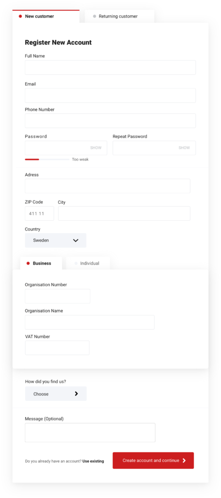
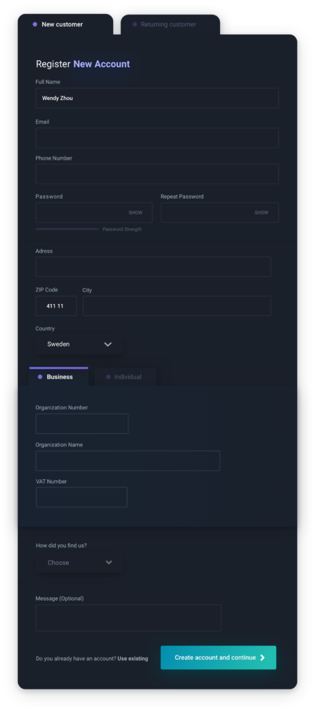
The visual design of the dark mode UI was made to make it appear more cool and modern, and therefore I loosened some aspects of accessibility.
But if this were to be implemented in a “real” life setting, the accessibility would be much more important. This is why I also created the design in a light mode and with more focus on accessibility.
To improve the accessibility further
To make the accessibility even better I could do the following changes:
- Make the font size larger
- Make the typography colors all higher contrast
- Make the form border colors higher contrast
- Design how tabbing would look for someone who uses tabs to navigate
- Skip the last drop-down and write out all the alternatives as buttons
Contrast checker
Checking color contrasts can be done with sites like Contrastchecker or by downloading browser extensions.
Buy books to learn UI Design
If you want to learn more about UI design, I recommend the following books.
Note! These are affiliate links, but my personal recommendations.
- Designing Interfaces: Patterns for Effective Interaction Design
- UX/UI Design: Introduction Guide to Intuitive Design and User-Friendly Experience
- Practical UI Patterns for Design Systems
- (Resource) Mobile UX/UI Design Notebook: Mobile Wireframe Sketchpad
Read my article about the 4 best books for learning UX/UI design for beginners >
More UX & UI design articles
If you’re interested in reading more articles about UX & UI design you can check out my related posts:
Great job. A have a question though: what if an user has to deal with forms many hours a day to perform tasks? Say a scenario of an admin panel or CMS. Is dark theme a good choice for that? Or you believe usar can be “eye-tired” using a dark interface?
Pingback: Hur man kan exportera After Effects som MP4 (utan Media Encoder) 2019 - Wendy Zhou
Pingback: Bästa UX/UI Design program och applikationer 2020 - Blog
Pingback: How I design custom UI illustrations using Sketch - Blog
Pingback: WEEKLY DESIGN INSPIRATION X2 _ CARL HAUSER | Wendy Zhou
Pingback: Veckans UX/UI Design Inspiration X2 _ Carl Hauser | Wendy Zhou